The box model
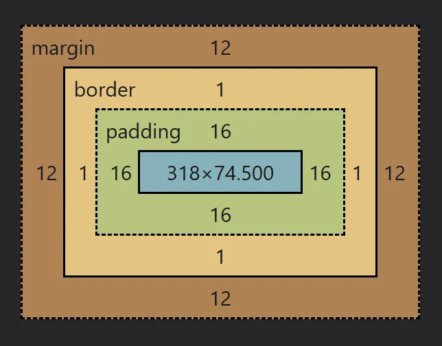
Every element is a box, and every box is made up of the content box, which is the content itself, followed by it’s padding, border, and margin, in that order.
The content box
Section titled “The content box”The content box, as the name implies, is the part of the box where the content lives.
We can visualize the content area by adding a background-color to an element.
By default, the size of a block element, like our paragraph in the example above (and most other elements you will use), have a width that is as wide as it can be, and a height that is as small as possible.
If you have an element with no content in it, it will have a height of 0px, so even if you have a background color on it, you won’t see it on the page.
The more content you add, the taller the element gets so as to accommodate that height.
Also, if you reduce the width available by resizing the window, it will grow in height as the text wraps.
These defaults are very good, and work in a pretty intuitive way.
Controlling the size
Section titled “Controlling the size”Before diving into how we can control the size of our elements, I want to preface this by saying you probably don’t have to manipulate the size of your elements very often.
The defaults are awesome and work really well along with the modern layout features we have.
In the old days of web development, we had to control the size of elements to create layouts because we didn’t have the modern solutions we have today, so it was much more common to have to control the size of our elements.
Now that said, it is still important to know how to control the size of things and how the box model works, and so we can take control using the block-size and inline-size properties.
The block-size control the height of an element (or, more accurately, the size along the block axis), and the inline-size controls the width (or, more accurately, the size on the inline axis).
Overflow
Section titled “Overflow”If we declare a size that is too small, content will spill out from the parent.
This is called overflow.
CSS was created to be lossless, so rather than clipping or hiding overflowing content, it stays visible, but the content overflowing outside of the parent has no impact on the other elements around it.
Setting contraints
Section titled “Setting contraints”One of the worst things you can do is be overly-prescriptive when declaring sizes of elements, especially when it’s for layouts. You can get away with it with smaller elements like icons, avatars, etc.
Instead, we want to work with the browser, leaning into the default behaviors that already work so well!
To do that, we need to think about why we want to declare a size in the first place. With the width of an element, usually we want to prevent it from stretching the entire width of the viewport. With the height of an element, we might want to prevent it from getting too small.
We still want the width to be able to shrink if the browser window becomes narrow, though. And when it is getting narrow, and the content needs more room to work, we want to allow the height to grow, rather than the content overflowing.
In other words, we want to set a maximum size on the width, and a minimum size on the height.
We can do both of those things with:
max-inline-sizeormax-widthmin-block-sizeormin-height
And, I will add, that people often think they need a min-block-size, wehen all they need is a bit of padding (more on that soon).
Padding
Section titled “Padding”Padding is empty space that surrounds the content area, and which includes the background color.
We can control the padding on the different axis as well, with padding-block controlling the padding on the top and bottom, and padding-inline controlling the padding on the right and left.
And, we can control them on individual sides as well:
padding-inline-start(padding-left)padding-inline-end(padding-right)padding-block-start(padding-top)padding-block-end(padding-bottom)
The shorthands
Section titled “The shorthands”padding is a shorthand for all four sides, where we can provide 4 values if we want, one for each side.
It starts at the top, and then goes around clockwise.
.different-padding-on-each-side {  padding: 5px 10px 20px 40px;}
/* that would be the same as this: */.different-padding-on-each-side {  padding-block-start: 5px;  padding-inline-end: 10px;  padding-block-end: 20px;  padding-inline-start: 40px;}
You can also omit sides too. If you have three values, the middle value will be used for both values on the inline axis.
.padding {  padding: 5px 10px 40px;}
/* that would be the same as this: */.padding {  padding-block-start: 5px;  padding-inline: 10px;  padding-block-end: 40px;}
If you provide two values, the first is for the block axis, and the second for the inline axis.
.padding {  padding: 5px 40px;}
/* that would be the same as this: */.padding {  padding-block: 5px;  padding-inline: 40px;}
And, as you probably noticed in the very first example, when you only put one value, it uses that for all four sides.
Borders
Section titled “Borders”Borders are the next part of the box model, coming after padding.
While padding provides us a way to extend the background color beyond the content box, borders allow us to add a border using a different color than the background.
There are three things we have control of on a border:
border-width- controls how thick the border isborder-style- gives us preset options for what the border looks likeborder-color- allows us to assign a color to the border
p { border-width: 15px; border-style: solid; border-color: #ff35de;}The width accepts any length values, so you can use px or rem to play with it.
The color works just like color and background-color.
The style has a few predefined styles for you to pick from:
soliddotteddasheddoublegrooveridgeinsetoutset
You can play with these below if you’d like.
The shorthands
Section titled “The shorthands”Borders take shorthands to another level when compared to padding.
The three properties above are shorthands, as we can apply individual border styles for each side of an element.
For example, I could select the top width with border-block-start-width, or the left side with border-inline-start-style.
It’s not very often that we need to use the full longhand of borders, though.
We also have a shorthand that combines those three properties into one, where instead of writing out all three of those properties, we could simply write border and then list out the values for the size, style, and color, like so:
p { border: 15px solid #ff35de;}There are some shorthands in CSS that require a specific order, but luckily borders is not one of them, so you can list the values in any order and it will work.
And, we can use this same approach for styling a border on one side only.
p {  border-block-end: 5px dotted #ee21fa;
  color: #fff;  background-color: #234342;  padding: 24px;}
The one time I use the full longhand for a border is when I want to overwrite something I did earlier in the shorthand.
p {  color: #fff;  background-color: #234342;  padding: 24px;  border: 10px solid #ff35de;
border-block-end-color: black;}Margin
Section titled “Margin”Margin works a lot like padding does, including the way the shorthands work, with the only difference being that margin creates empty space that does not include the background-color.