The Box Model & Layout Modes
We’re about to move into creating layouts using Grid and Flexbox, but before we do that, we need to talk about the box model and something called Layout Modes.
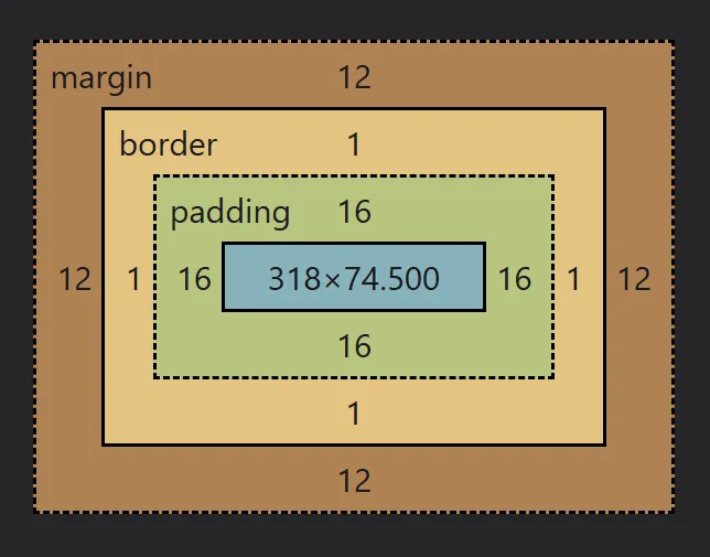
The Box Model
Section titled “The Box Model”All HTML elements are boxes made up of several boxes:
- Content: The actual text, images, or other media.
- Padding: Space between the content and the border that includes the background, if there is one.
- Border: A line that surrounds the padding.
- Margin: Empty space outside the border that doesn’t include the background.
At it’s core, it’s quite simple: you define a size for the content area, then the padding, border, and margin on top of that.
Not all boxes are created equal
Section titled “Not all boxes are created equal”There is a thing that’s pretty unique to CSS that causes a lot of frustration when it comes to how layouts which, which is how one declaration can potentially change how some properties and values work.
Previously, I mentioned how the auto value doesn’t work the same when we apply it to the height or width, for example. With these, the auto values are quite intuitive, so people rarely even notice they’re different.
However, if you were to decalre width: 1000px on an element, you’d expect it to be 1000px wide, right?
In many situations it will be, but in many others, it wouldn’t be!
<span class="box">Not 1000px wide</span>.box { width: 1000px; background: lime;}Do you know why it’s not 1000px wide?
Not only does width not work on inline elements, but it also can change how it works in other situations as well.
And this is because when we use different display and position values, we’re
enabling different Layout Modes.
When we change a layout mode, we’re changing the algorithm the browser uses to create that layout. The layout algorithm is what is used to determine everything from the position and size of an element to how it interacts with the other elements around it.
Some properties apply to certain layout modes, and not others, like how we can use flex-wrap only when using Flexbox, or how we can use top, right, bottom, and left when we use the positioning properties.
Other times, the way values work change as well, as we saw with the Flexbox example above.
A bunch of levers and dials
Section titled “A bunch of levers and dials”Because CSS is a declarative language, it feels a lot like we’re simply pushing levers into specific positions.
For example, we have a we have a display lever, and can move it between inline, block, inline-block, flex, grid, and so on. Next to that, there is a padding dial that we can use to increase or decrease the amount of padding on an element.
Some of the levers and dials, such as our one for padding, are very straightforward.
Others, like the display lever, seem just as simple at first glance, but when we pull that lever, we’re affecting the other levers and dials, with some hiding away and others becoming available depending on what value we pick.
Throwing that display lever over to inline suddenly removes the width and height dials for that element, and pushing it a little further to get to flex value, we suddenly unlock a completely hidden set of new levers and dials.
And on top of that, with values such as flex and grid, not only are we exposing more controls for that element itself, but we’re also exposing more controls on the children as well.
So, while we do have shared properties and values, the way those values and properties work can be drastically different from one layout mode to the next.
In a way, this makes things easier
Section titled “In a way, this makes things easier”While the inconsistencies between the different contexts can feel frustrating at first, in many ways, it makes things more straight-forward, because we only need to think of what mode we’re in.
Learning those rules can take a little bit of time, but for the most part, the new ways things work make sense within the context those elements are in. Like, most people realize that width becomes more of a suggestion in a Flexbox context, as an example.
For now, I don’t want you worrying about what all the differences are, or even what a Layout Mode is, but just be aware that changing the display or position of an element means you’re working with a new algorithm, and between each one, things aren’t mean to work in the same way.
As long as you keep that in mind, when things don’t act as you’d expect them to, you’ll often be able to pinpoint the reason down to the context you are working in, and find a solution much quicker.