Responsive Layouts
Before we dive into learning how to create responsive layouts, I think that it’s important that we’re on the same page as to what a responsive layout even is.
The term Responsive Design was first coined by Ethan Marcotte in an article for A List Apart back in 2010.
As the name implies, it involves writing CSS that allows the layout to respond to how a user is consuming the content, with “Fluid grids, flexible images, and media queries [being] the three technical ingredients for responsive web design.”
What does a responsive design look like?
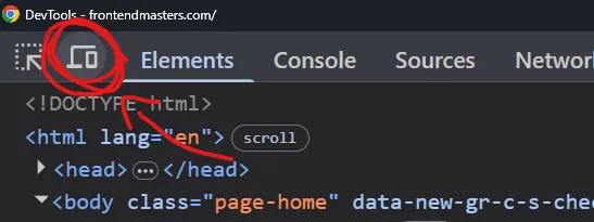
Section titled “What does a responsive design look like?”Most websites on the internet today provide a good example of what repsonsive design is, so why not take a look at the Frontend Masters home page to see it in action.
You can simply resize the browser window to see it in action, or you can use your DevTools responsive mode.
How do we make websites responsive?
Section titled “How do we make websites responsive?”For a long time, media queries (@media) were a very big part of the idea of responsive design.
More recently, Jen Simmons coined the term Intrinsic Design, which she explained as the next stage of design, where we let the browser do a lot of the work for us based on some limitations that we set on our layouts.
I strongly believe that intrinsic patterns should be our first line of attack, followed by bringing in media queries (or container queries), where needed.